
Typeface
Cooldown Sans
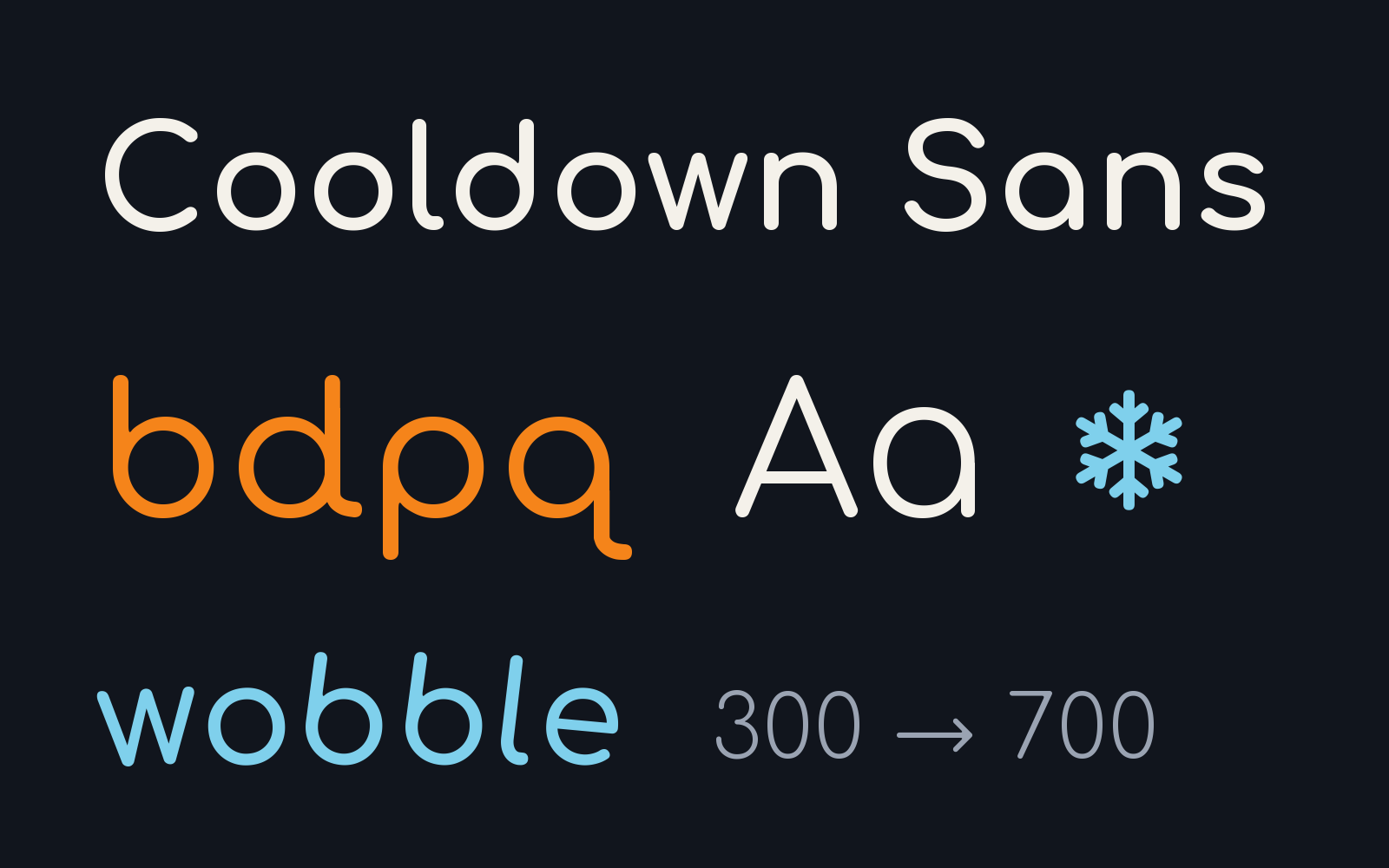
We use Cooldown Sans by default in all our projects. We make serious games, museum exhibits and learning tools, and the people who play them include children, dyslexic readers and people with low vision, so we built a typeface for them. Dyslexia: d and q can end in a rounded tail, so they are never b and p turned around, and letters sit a little further apart. Low vision: the height of the lowercase letters adjusts, for small text and for kiosk screens read from a few steps away. For fun: each letter can tilt its own way, as if written by hand, and dots can turn into little snowflakes, because a game should look like one.
Features
- Tails on d and q (stylistic set ss03), so b, d, p and q never mirror each other
- Adjustable lowercase height for small text and screens read from a distance
- Wobble axis: each letter tilts its own way, as if written by hand
- Weights 300 to 700, snowflake dots (ss02) and a snowflake glyph
- Used on every ColdSnap game, app and exhibit
Related projects
-
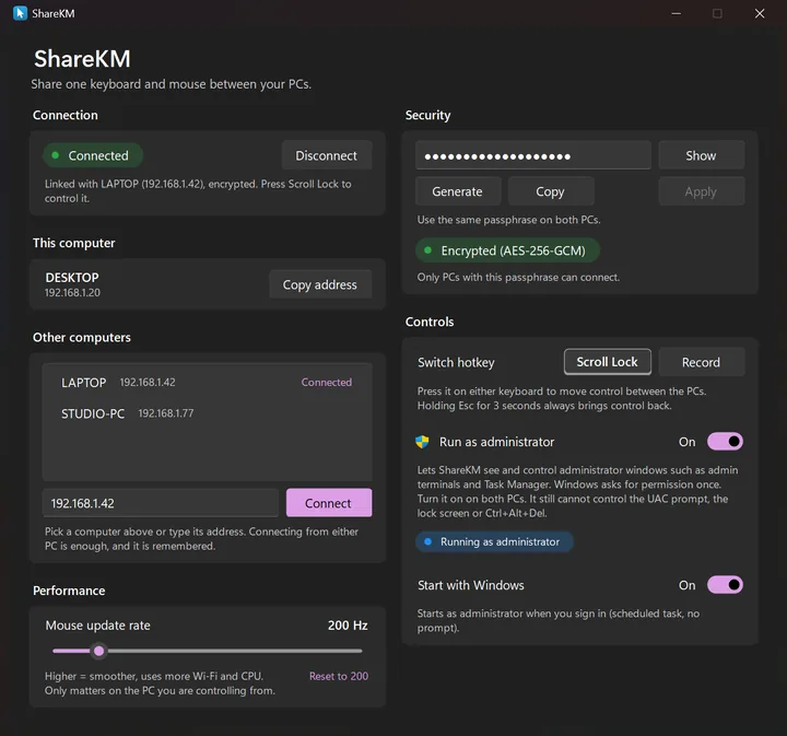 ShareKM Windows AppShare one keyboard and mouse between two Windows PCs, with encrypted pairing and shared clipboard
-
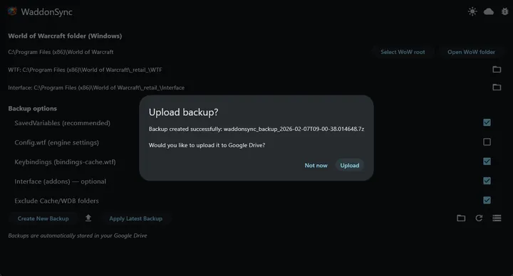 WaddonSync Desktop AppBackup World of Warcraft addon data to Google Drive automatically
-
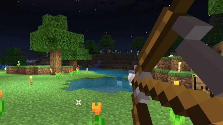 Magic Arrow Minecraft PluginMinecraft plugin adding block-placing and elemental abilities to bows based on the block you stand on